1982 Topps
Card I selected: #490 – Dennis Eckersley
There was a limited number of guys to select from in 1982 for a few reasons. First, there were only 2 coca-cola teams sets in 1982; the Reds and the Red Sox. So that limits me right away to 44 players from each team. And it’s a bit smaller when you factor in the players who weren’t in the O-Pee-Chee set. None of my selected “best” cards from 1982 are Red Sox or Reds. I did pick Johnny Bench as my favorite Reds card, but it was a down year for Topps photographing Reds players. It’s not even a great Johnny Bench card. So I went with Eckersley as I liked the photo. That’s the 2nd straight year I’m doing a Red Sox player. Yuck.
# of cards (including the Topps card): 3
The parallel sets in 1982 include:
- O-Pee-Chee
- Coca Cola team set
Scans:
1982 Topps #490


1982 O-Pee-Chee #287


The Canadian version of the Topps set. The OPC set size increased to 396 cards, now exactly half of the Topps set which had been bumped up to 792. Here are the differences for this card:
- The “O-Pee-Chee” logo on the front replaces the Topps logo in the lower right.
- The card number is different.
- The position is spelled out in both English and French .
- The copyright says O-Pee-Chee and notes the card was printed in Canada.
- The card is printed on white card stock and tends to be poorly cut as cards from the early 80’s were for OPC.
- Any wording on the back is in both English and French.
- There’s an O-Pee-Chee wording on the back instead of “Topps”.
1982 Coca Cola Red Sox #5


Topps issued 2 team sets in 1982 as a promotion with Coca-Cola. Both 23-card sets feature 22 players from the team and an advertising card. Here’s how you can differentiate these cards from the Topps version:
- There is a square Coca-Cola logo in the lower left corner on the front, where the “hockey stick” bends. For the Red Sox, there is also a logo for Brigham’s ice cream, a local New England favorite. Eckersley’s signature is so long they had to move the placement on it for this card.
- The card number is different.
- The back is red instead of green.
- The position on the back is just the abbreviation and they fit the player’s number next to it.
- There’s a Brigham’s logo on the back where the Topps logo is.
- There is copyright information regarding the Coke logo on the back.
The “Rainbow”:

Any sets I didn’t get: There was a printing error that occurred on sheets for about half of the cards where the black ink didn’t print on the front. The black line inside the white border and the player signature aren’t included. Eckersley has a blackless variation. I thought about including Topps blackless cards, but they aren’t cheap and I don’t think an error is really a parallel, even if it’s one that happened on about 120 different cards.
Other cards I would have liked to do:
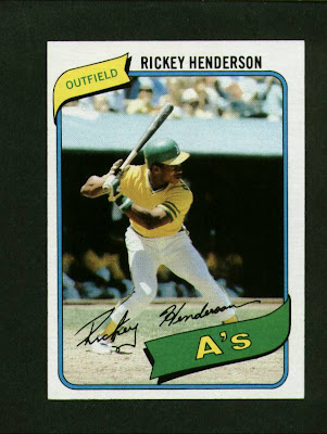
- My favorite cards from this set were Rickey Henderson, Nolan Ryan, Carlton Fisk’s In-Action subset, and Jon Matlack. None of them are Reds or Red Sox, so I didn’t get to go after those guys for this idea.